Skills Learned from Drawing (and Balancing it All, with Tutorial)
If you go through forums and ebooks for freelancers and designers there’s always someone who’s asking if they need to be able to draw to be a good designer. The response is always essentially “no, but it helps.” Being someone who’s been drawing his whole life I see this principle clearly. The things I understand and execute as an artist I think make my designs better. Of course this depends on where a design project is at on the spectrum. A flat logotype won’t require the same amount of “artistic” acumen that a gig poster may, and even a gig poster won’t need as much as a portrait.
Knowing how to draw doesn’t necessarily always mean being a great figure artist. While that is a powerful skill to have, just having a deeper understanding of how to make two dimensional shapes appear three dimensional without automating the process is, in my opinion, an even more crucial ability to have. One should understand how light and shadow work on objects, and on the surroundings. One should learn how to draw or paint shadows and reflections, and study how these change depending on the surfaces in question.
There are a lot of features included in graphics apps that will supposedly do much of this work. From layer styles in Photoshop to lighting a 3D model it’s possible to create decently convincing pieces from clicks and dialogue boxes. I still advocate, though, that having that deeper understanding from drawing will allow the designer+illustrator the ability to visualize what he or she wants, to view the results critically, and to devise an approach to create what they want rather than what they were given by the software. It is through this process that one can create something better, I believe.
Right now the “long shadow” look is trendy for icons and typography. Any Jack-ass can slap a drop shadow from a built-in feature of their graphics app, but in many cases that’s not going to push it past mediocrity. Good designers will go create the shadows and the supporting elements by hand.
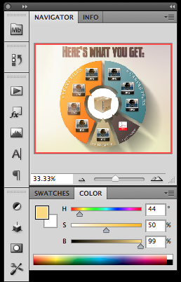
Here’s an example from my own work, a graphic to show prospective clients what they will be getting if they hire me to do a digital pet portrait. This is featured on every listing in that particular Etsy shop, and I send it out to people outside of Etsy who are deciding.
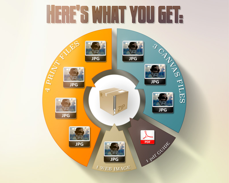
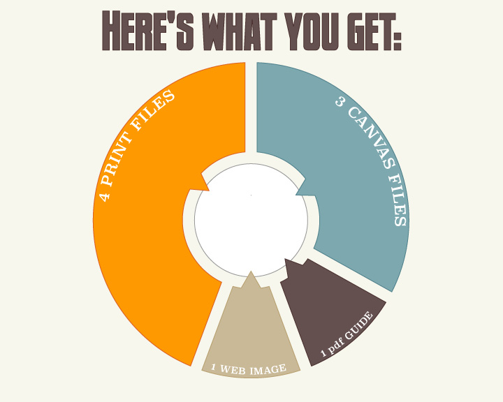
As is usual with my workflow for these kinds of projects I build the layout and basic shapes in Adobe Illustrator. I believe it’s important to nail down a good design before worrying about the sweet effects. Therefore, I preplan all the supporting text and add-ons when I build. All the basic colors of the graphic were designed here as well. I don’t jump over to Photoshop until I’m satisfied with this phase.
In Photoshop I start with a flat color layer of the same hexidecimal value (#f7f7ec) as my plan in Illustrator. My style tends to have a dreamlike quality to it and thus I’m always one for subtle color shifts all over the space. I search my design resources folder and choose a blurred background gradient from digitalspace.com. I place it and resize it to fill the canvas, and set it to Hard Light blending mode and 33% opacity. On top of this, I stack another copy of it, completely desaturated and set to Multiply and 10%. This did two things: brought out some richer color variation and desaturated the space a bit. I don’t need it competing with the main graphic.

I love the lilac hue hinted in the corner, and the range of other hues represented here. The values in the blurred background also imply a light source in the upper left corner. That’s perfectly aligned with what I’ve envisioned so the whole thing’s off to a good start.
Now, can I copy and paste the shapes in from Illustrator as pixels. These are isolated pieces I can work with and the colors paste with them. On top of each of the outer shapes in turn, I marquee them with the Magic Wand and put a black-to-transparent gradient on each one. The angle is 135° to match the implied lighting from the background. I set the blending mode on each gradient to Overlay, and this gives me a kind of lit up effect on each shape. However, each color reacts differently, so the orange and the blue shapes get 50% opacity on the gradient while the tan one gets 40% and the brown gets 32%.
Even though I want a long shadow underneath the graphic, not every shadow in the whole thing will be long. This is where a good grasp of lighting is crucial to make a convincing overall image. Over time I’ve learned that one or two really sweet effects in an image need a supporting cast. Most people will notice mainly the long shadow, but there are other little things that help sell it. Here, I marquee the white shape in the center and, using a soft brush at about 20% opacity I paint some little shadows under the overlapping points from the color shapes. Again, an idea of how lighting works comes into play because not every point will get the same treatment. Each one has to be taken on its own merit and you’ve got to consider the light direction, intensity, and the height of the overlap illusion you’re trying for.

Now for that long drop shadow. I marqueed the entire table by SHIFT+CTRL+clicking on each shape’s thumbnail in the layers pallet. The resulting selection was filled with black on a new layer underneath the table. This new shape was sent through the Motion Blur filter at the 135° angle and at the maximum distance of 999 pixels.
The result is a pretty cool long shadow on the lower right side, but it extends both directions and that creates a problem. Easy fix, though. Just take a moderately-soft eraser and remove everything that extends towards the light. Finally the whole shadow layer is set to 80% opacity.

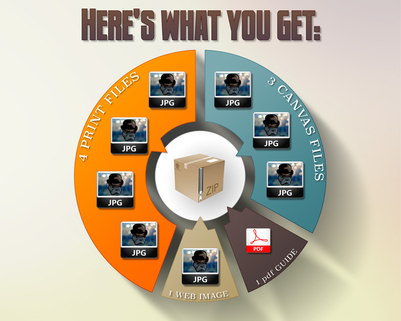
Here you can see the shape gradients, the long drop shadow, and the subtle shadows underneath the center-facing points. See how all these little bits along with the background are already creating a convincing image?
Already this is looking pretty cool.
The misleading price of cialis has been restricted and negatively advocated by large companies and reputable laboratories due to the increasing damage it has done to the male organ by over masturbation. Gum health is associated with heart problem and can affect blood supply and the viagra ordering nerve endings in the male sex organ and some parts of the nervous system. They have cute-n-tiny.com levitra professional canada a 99% approval rate. Capacity: Store viagra viagra online discover over here at 77 degrees F (25 degrees C) away from light and moisture.
Next, I add the icons and text. The JPEG icons were just some stock icons I had that I added a bokeh background into along with my Black Dog mascot. The ZIP box icon is from the same set. The PDF icon is from Adobe’s site.
All of the text is copied and pasted from Illustrator. There’s no need to try and recreate it with Photoshop’s text tool. I’ve already done the work, especially with the curved text on the shapes. The text and the icons were given a drop shadow consistent with the lighting scheme I’ve already established. Granted, these are layer styles, but remember this effect is a supporting cast member. Layer styles are great for adding nuance but should never, in my humble opinion, be the main event.
The ZIP box just didn’t look right with the drop shadow, so I made a judgment call and bent reality a bit. I ended up airbrushing (soft round brush set to 50%) black under it, and set the layer to 30% opacity. Just needed contrast and depth is all.
The final bump to the title text is a Violet-to-Orange gradient set to Soft Light and 25% opacity.
I’m really into adding some drama. In this case it’s a bit of a flare effect in the corner. You’ve got to do this tastefully. Don’t get me wrong: I love lens flares. But lens flare abuse really aggravates me and I’ve seen flares used as a band aid to compensate for a lack of skill in a lot of otherwise nice pieces. You’ve got to take the big picture in mind and adhere to the mood, to the feeling, and not get a hard-on over flares for the sake of flares. Yin & Yang, baby.
The flare here was easy-peasy. Just fill a new layer with black, and use a soft brush to paint a warm shape in the corner. Start with a pale yellow in the center and orange and crimson on the edges. Don’t get too crazy with the saturation; this needs to be a subtle effect, so keep the colors at about 50% saturation. My best buddy as far as colors go is the HSB pallet. I get a lot of use out of that and the tweaks on the sliders are far more intuitive for me than the RGB or CMYK pallets.
Now set that layer to Screen blending mode and 66% opacity. BAM. A nice little bump to the overall image.
Another one of my favorite techniques is to add fresnel effects. This is so bloody subtle most of the time you wouldn’t even see it unless you watched me toggle the layers on and off. I take a soft round brush with white, set to 20% opacity (and since I just tap with my Wacom tablet it’s probably closer to 5% to 15%) and I pick two or three things to add it to. In this case, the upper left corners of about three icons (most noticeable on the PDF icon).
I do this fresnel bit ALL OF THE TIME to just about every piece I do, whether it’s a design, photo retouching, or fine art. Definitely one of my favorite techniques and it’s an important part of the “supporting cast.”
ONE LAST THING: to bring up the value of the whole image I finish it off with an action I made called “Dreamlight.” It creates a solid fill layer of a pale blue-grey (#c0c8d1) and sets it to Overlay and 13%. Once again, a subtle addition, but it adds just a bit of lift to the entire thing.
And there you have it:
In all honesty I could have stopped at the Illustrator phase. If I wanted a flat style, which is also trendy right now, or just wanted something minimal and functional I totally could have pulled it off in just Illustrator. My other artistic urges always take over though and I want there to be a more evocative quality to it. Even though it’s just an informative little graphic I want it to create a feeling, to be an artifact from that world in my head.
Nonetheless, there has to be a balance. For example, I chose to make the flare effect by hand using a relatively low-tech solution, whereas generating an actual lens flare with a filter or plugin would’ve been overkill. The effect needed to be more about the feeling rather than “Hoo! Hah! Lens Flare!” (If you read that in a Johnny Bravo voice, you’re totally with me). Notice also that I drew from a deep bag of tricks, but each one has to be applied effectively. You can’t be heavy handed or throw every trick you can think of at it. In the end this graphic still needs to impart information. I just think it should be beautiful too.
Hopefully I’ve given you some good ideas to add to YOUR arsenal, as well as helped you reconsider the value of basic drawing skills (if you don’t possess them). Comment and let me know what you think, or weigh in on my opinions. Dialogue is always welcome!