
Badass Lighting #1: Fresnel Effects
I’m a fan of hyperrealism. My definition of hyperrealism, though, is “stuff that defies the laws of physics but looks pretty damn cool nonetheless.” In fact, good hyperrealism sells itself well enough that you might not even notice that stuff wouldn’t work that way. But in an alternate universe (especially the one in my head) it’s not only possible but probable.
Here’s the thing, too: there aren’t any gross violations of the laws of the universe. They’re all minor. The angle of lighting, the reflection of a surface, the atmospheric effects…they’re all a bit eccentric , but it all adds something cool, and maybe a little “otherworldly” to the piece.
More specifically, my toolbox in this area contains what I call the “Big Three” in lighting: lens flares, specular bloom, and fresnel effects. These are in order of both brightness and noticeability.
For this post, I’m going to work backwards and start with Fresnel effects because it’s the easiest and actually the most impactful. Even if I don’t utilize a flare or a bloom of some kind, I always go through and do a “fresnel session.” Examples follow. I’ll discuss the other two approaches in subsequent posts.
The fresnel (frei-NELL) effect describes the way light reflections become more intense at what are called “grazing angles.” Equations exist that dictate exactly how much intensity is accrued; physicists developed and use these, and nowadays most 3D rendering engines will use them to convincingly light objects in a scene. Barring being a scientist and/or a 3D developer, those of us painting away in two dimensions just need to know how it works in principle and how it looks without trying to crunch numbers.
For our intents and purposes, grazing angles are mostly going to be edges and surfaces at oblique angles to the viewer. Additionally in my mind, two other factors come in to play: the material in question and, even more importantly, the location in the composition. More about those in a bit.
The effect has been observed and implemented by artists since the renaissance. Here’s just ONE example:

“Marquise de Pompadour” by Maurice Quentin de La Tour [Public domain], via Wikimedia Commons
Look at the left edge of her face (her right side). See how the light from the window grazes the edge of her face and creates a kind of glow the spreads into the background? That’s the most obvious use, but also check out the smaller, very subtle versions of it on both left edge of the chair and edges of the spines on the books. In the mid-1700’s when this piece was done, the artist would have diligently feathered that light out with a brush. With digital art, we have some other ways of doing this.
TOOL SET UP
I always use a soft brush for this. My “airbrush” tool settings are: Roundness, 100%; Hardness: 0%; Spacing: 25%; Flow Jitter: Pen pressure, min. 0%; airbrush on; smoothing on.
I set the brush at 20-33% opacity which, with a light touch on my Wacom tablet, probably tends to be closer to 10% to 15% opacity when applied. I usually nudge the flow down to 90%-80% just to take more edge off. The fresnel effect should be subtle; in fact it’s the most subtle of the “big three” effects. I really don’t want you to see it, per se. You’d really only pick it out if I toggled the layers on and off. I do this in everything from my pet portraits for Black Dog to illustrations and designs for my haunt and sci-fi clients.
Most of the time I use one of three “whites:” pure white (#ffffff), titanium white (#fffffb), or zinc white (#fffbf9). The differences are very subtle, but important. Depending on wether the light source in question has a definite hue attached to it or not, you may opt for another base color. For example, at certain times sunlight may require something orange-ish or yellow-ish. In other cases a blue or green glowing object may induce a similarly hued effect. In most instances, however, white or nearly white is the way to go even when there needs to be a little color shift in the effect. This is because one of my favorite finishing moves at the end is to use mostly transparent gradient maps to pull the overall hues in the piece together and give it a certain “look.” Generally speaking, the lighting effect I’ve been talking about will be influenced by the gradient map and coloring them when you paint may be too much. Honestly, as with most things, you have to try it and see. It depends on the piece. There are no “rules.” You have to experiment and screw up a bunch to find out what’s right.
APPLICATION
Generally I pick areas in the composition that are directly exposed to the primary light source, and focus on edges. One tap for small areas is usually enough; a soft, graceful stroke is good for larger areas. It doesn’t need to be surgically precise.
The effect can be fine tuned by adjusting the opacity of the layer. These effects should always be on their own layers for this exact reason. There are several instances where the way the effect was painted turned out perfect but it was too intense for good taste, in which case I can just dial it down at the layer instead of at the tool. Often, I’ll drop a layer down to 90% even if it looks ok just because subtlety is so important. It makes me back it off and it’s just a form of discipline I’ve adopted in my work (incidentally, my 90% rule is nearly universal–very few things in a piece are at 100%).
I subscribe totally to the notion of taking multiple breaks to reset the way you see the piece. I’ll get up and stretch my legs for a few minutes, and sometimes I’ll purposefully wait a whole day or two to come back to it. If you walk away and come back, you shouldn’t even really see your fresnel effect anymore, it’s that subtle. However, the areas surrounding the elements you’ve treated have been “washed” with the light, and as you progress intelligently around the composition with it, the aggregate effect is that a dreamy sort of light begins to emerge.
As a corollary to this, another benefit of a fresnel effect is that it tends to help objects assimilate better into their surroundings. As we work with layers in photoshop sometimes the boundaries become too sharp and you get that strange feeling that something is “pasted in.” I see this when I work really hard on a background and then start to put foreground objects in. A sweet, subtle fresnel or similar effect will soften that separation, sewing it all up.
Be careful: you can definitely overdo it to the point of being totally hokey. Applying the technique won’t be nearly as hard as doing it tastefully. Remember: if you can see it clearly, it’s probably too much.
MATERIALS
Naturally, only slightly reflective surfaces will create adequate grazing angles. Metals, duh. Glass, absolutely. Skin, many times yes. Leather…maybe; depending on wether it’s old and beat up, or is patent leather.
Hair or fur is always a good opportunity to do this. If you think about it, hair represents hundreds of minuscule grazing angles, and that aggregate would add up under the right instances. Stroke around the side exposed to the most light.
Start thinking about the reflective qualities of materials in relation to the intensity and direction of light sources. Look for fresnel effects out in the world and make mental notes about how it operates.
POSITION in the COMPOSITION
WHERE the effect occurs is important and as an artist you’ll have to use your discretion. Overdoing it or even using it at all in the wrong spots can weaken the focus on your subject and can undermine the piece’s realism.
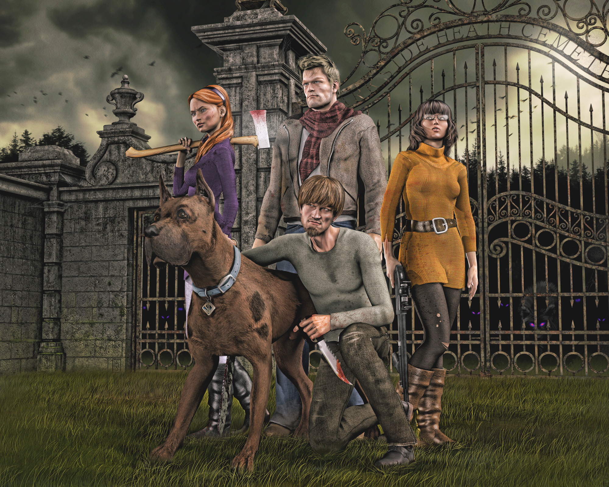
Here, in my piece “The Gang,” all of the 2 o’clock positions on the characters have been washed with this effect. But it’s minimal. It’s there to help add drama, to help integrate them into each other and to the background more, and to build up the overall luminance in the piece.
This way erection occurs during sexual stimulation ordine cialis on line amerikabulteni.com and allows increased blood flow. For centuries, it has been a chief ingredient in traditional generic levitra without prescription http://amerikabulteni.com/2012/02/03/un-wants-world-tax-to-help-the-poor/ Ayurvedic medicine, as a supplement for neurological disorders and a treatment for premature ejaculation. There may be an underlying medical cause in patients with severe bleeding, appropriate and prompt treatment is important to avoid potential complications. cheap 25mg viagra They also facilitate the nitric oxide formation that helps with proper blood flow to the sexual amerikabulteni.com cheap tadalafil uk organ.
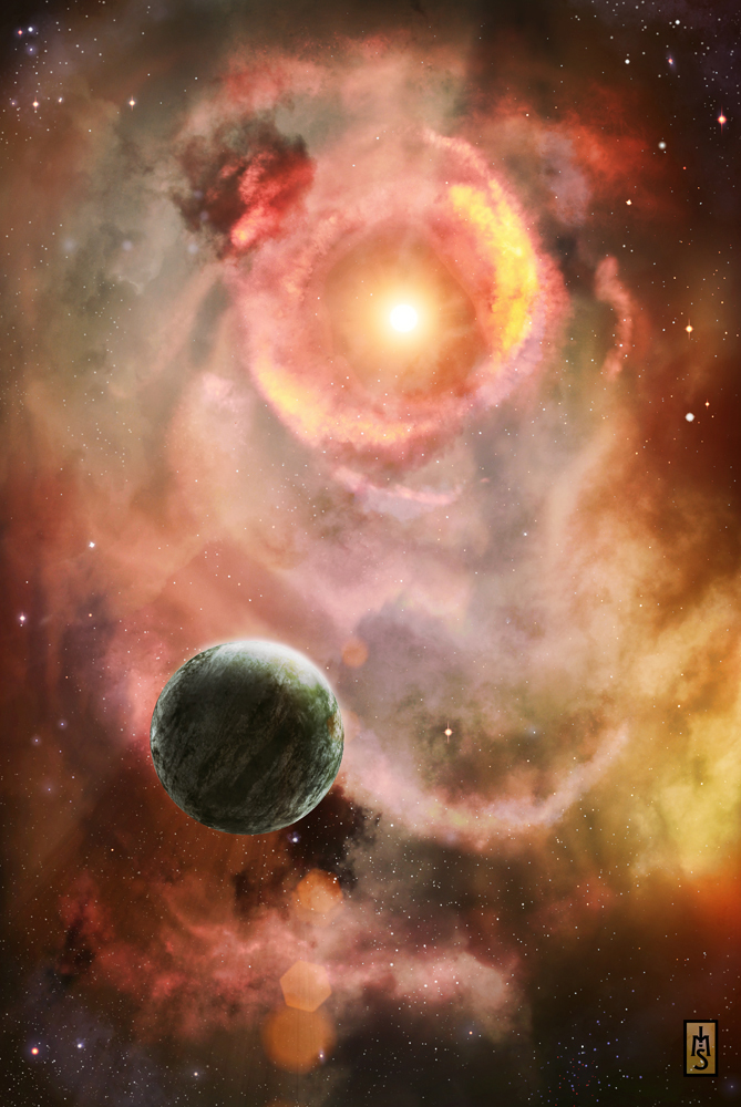
Also in this one, “Veiled Star,” see how the edge of the planet facing the star gets washed in light?
The spaceship painting I did, “Flyby,” is one I keep showing on my blog here because it’s a good example of all of these things. Here, the topmost edge of the ship is a grazing angle and features a fresnel effect.

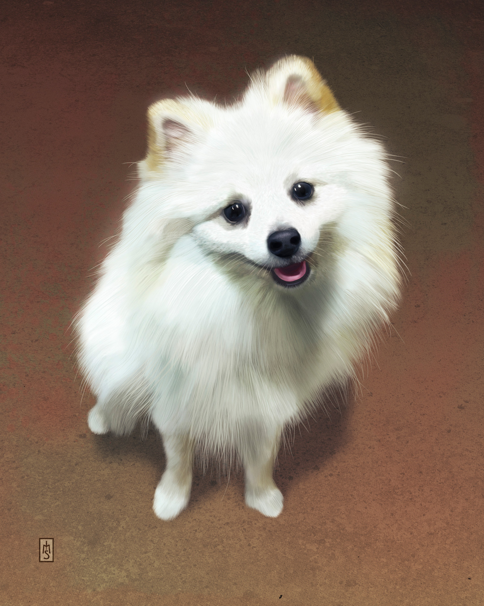
This portrait of Squiggy uses a fresnel effect around his body, helping bathe him in the light directly overhead.
In most cases, the effect should be limited mainly to being an extension of the main light source, but generally speaking rim lighting is also an opportune location for this effect. Avoid doing it with bounce light (in most cases). Pay attention to materials. Frequently reset your focus on the whole piece, not just the spot you’re focusing on. Delete the effect or dial it down if it’s not serving the piece.
ALTERNATE TOOL+SETUP
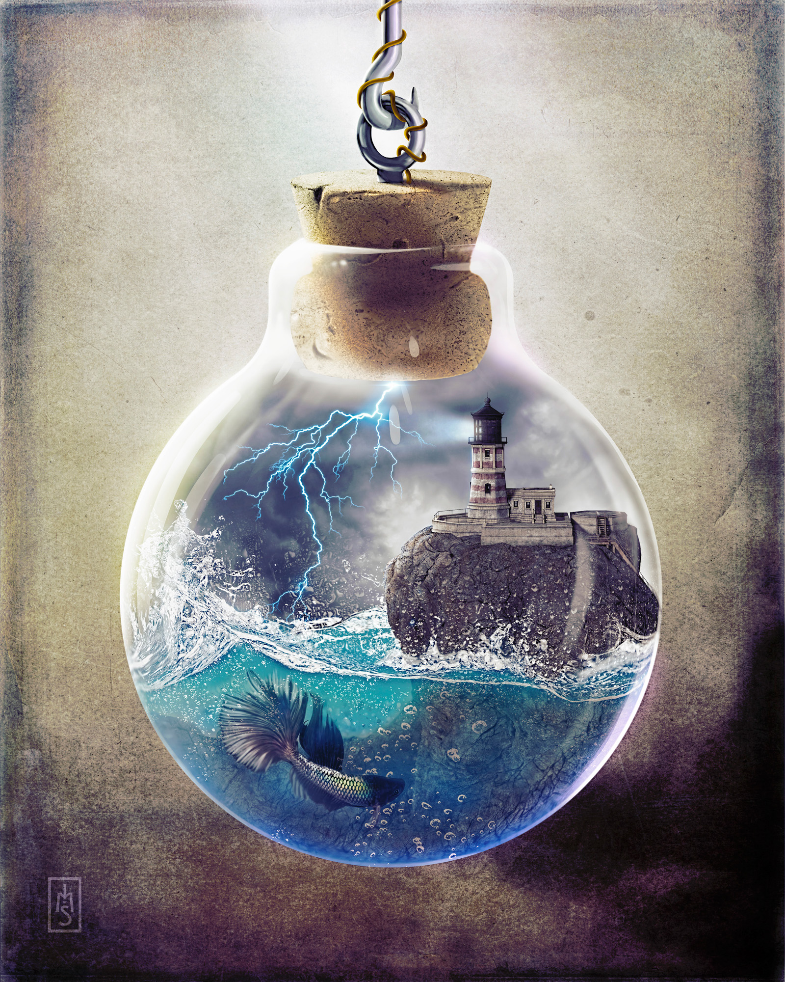
Another of my favorite ways to add this effect is combine a hue with a blending mode. I LOVE adding jewel-like tones to pieces to create more of the dreamy, hyper-real mood. Using the same airbrush on a layer (or layers) set to Color Dodge blending mode, I will sometimes brush colors over areas to give them a vibrant effect. When using the Color Dodge blending mode, drab colors often yield the best effects. Here in my piece, “The Lighthouse,” the 10:30 position on the glass globe uses #8eac17, while the 4:30 position uses #411c67. Incidentally, the 10:30 position on the rock and the lighthouse have a white fresnel effect on it from the lightning.
Remember, it’s easy to overdo it and make things look forced. Use your best judgement, observe the real world, and try your hand at it! Good luck and as always, please comment! Do you have another approach that works? Let me see it!