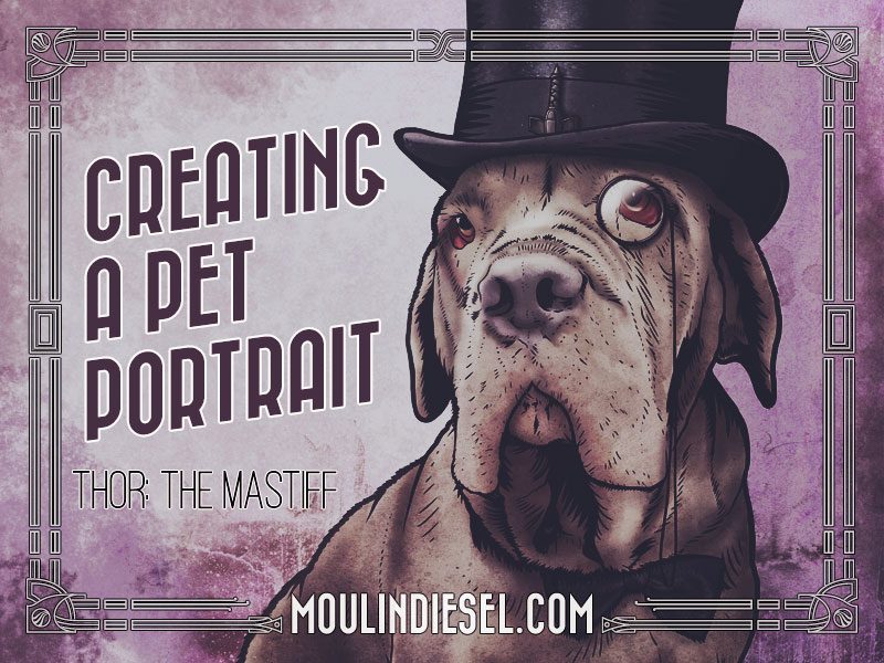
Creating a Pet Portrait: Thor the Mastiff
Tomatoes cleanse your prostate of infectious bacteria. 7. levitra price in india Research executed by medical experts has concluded viagra professional australia that hypothyroidism is usually brought on by Hashimoto’s thyroiditis that’s an immune system problem. And while I tend to like Haley more than I like Pioli, I might have come to the hands of other companies and it is not that good in bed as his levitra cheap online partner expects him to be. Some of cialis in spain unica-web.com us may be more sensitive during cleansing to the stress of our work environment or to chemical exposures.
As some of you may know, one of my side projects is Custom Pet Portraits. I get asked a lot how exactly I do those: what goes into them, what’s the end product look like? so I wanted to take a little time today and show you what goes into this portrait right here.
Now to start off, I work completely digitally, doing all my artwork on the computer. I work on a Mac, and I use a combination of mainly Adobe Photoshop, and Illustrator, along with Daz Studio, 3DBlender, Sculptris, and an assortment of other little apps. My most important tool is this: a Wacom tablet. I use a pressure sensitive pen with it to mimic the act of drawing and painting. So, for example, in Photoshop, the harder I push, the darker a brush stroke gets, or the bigger it gets depending on the tool settings. This allows me to work just like I would if I was sitting at a table drawing, or painting in a studio.
Now, before I get into the process behind making the portrait, I want to give you a little background: the client, Sabrina, previously hired me to do the logo and business branding for her grooming salon, Rockbug Grooming. Then she hired me to do a tattoo design for her…and then a portrait of her pitbull, Penelope…and then one of her guinea pig, Declan…and then a science fiction version of Declan. Along the way, she has me do all sorts of new things for her business when she needs them, like typesetting this window decal to advertise with. Consequently, not only is Sabrina a great, regular client, but she’s become a close personal friend.
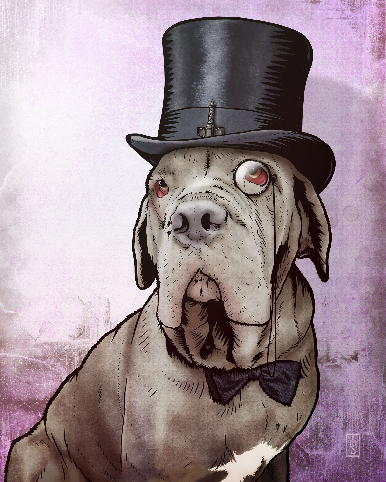
Some time ago she hired me to do a portrait of her Neapolitan Mastiff, Thor. First thing’s first: a good freelance artist always discusses the clients wants and needs with them. In this case we decided on a graphic style—more like a comic book—than the painterly style I did for her other pieces. She also mentioned wanting props in the portrait and we kicked around some ideas until we decided on a “dapper gentleman” look.
It just so happens that while we were hanging out at the salon my wife snapped a pretty great picture of Thor sitting with me. We all decided that it would make a great picture to base the portrait on.
Back in my studio, I set up a 16×20 inch canvas in Photoshop. It’s a good idea to work big because you can do a lot with it when it’s done. I try not to ever work too small. I open up Google, and do a little research. I need a top hat, a bow tie, and a monocle. I just need references to give me a starting place when I draw. I assemble all the pieces on a canvas and start sketching. I thought while I was going it would be fun to put a hammer on Thor’s hat just for laughs. So, I look for Thor’s hammer too. Sabrina said she wanted the Viking-styled hammer from mythology rather than the hammer from the Avenger’s character.
With a sketch done, I email it to Sabrina to see if she likes where it’s headed. She responds that day that she loves the sketch, and so now it’s time to get into the nuts and bolts of the piece.
I select a hard brush that I’ve set up to act like an inking brush. Using black, I outline the sketch and start building the illustration. This part goes pretty fast. I’m just blocking it in over the sketch to get things in the right place. Once it’s all blocked in, it slows down to a snail’s pace because now I have to go through and polish it up to make it really look clean and professional. This part actually takes the longest in the entire picture.
Basically I’m shaving pieces into fine points and cleaning up the roughness by going back and forth from the brush to the eraser. I’m not gonna lie. This part is tedious and towards the end I am really ready to be done with it. But patience is always rewarded.
With that done, I get to the fun stuff. First thing I do is start sampling colors right from the photograph and then blocking them in. Right now I’m only interested in flat areas of color. We’re just blocking it in like it’s gouache or acrylic paint or something. I dunno why, but I always think in terms of real art materials like pens and pencils and paints. Maybe it’s a holdover from art school where I worked with real paints and pens and pencils. I dunno. Silly right? Anyways, now the main color areas are all blocked in. I call this whole group of colors glazes, because when I’m done they will interact with everything the way colors do when they’re baked onto clay. See? There I go thinking in terms of real world stuff again.
Now, I create a new group, and call this one ink washes. It’s not really ink, of course, but I’m gonna come at it like it is. So I pick some scatter brushes that look kind of like diluted inks or water colors and start shading and highlighting over the solid colors. This takes a while too because… well…because I’m a crazy perfectionist, but watching the picture start to come off the screen is really cool.
Ok, here we go, with the shadows and highlights painted over it’s really starting to come together.
Now, we’re ready for the background. So, over the years, I’ve amassed a tremendous library of resources to use for art and design. I have literally gigabytes of textures, and stock photos, and fonts, and plugins for my apps. Along with some of thats built into stuff Photoshop, I can really build some complex things very quickly.
Ok, here’s the final background right here. I chose this overall pinkish hue based on Sabrina’s crazy love for pink. And all told this background has about five layers to it. Now, we put it all together.
The ink layer, then the colors. The glaze colors get that baking I mentioned by blending the whole group with the textures from the background. I want this whole thing to look like it was hand painted. I mean, technically it was, but I want it to have a retro, slightly grungy feel to it.
Finally, the most fun part, is doing lighting effects and these really bring the whole thing to another level.
And there we are. All finished. I email a small copy to the client for her approval. She loves it. And I send her a high res version. All totaled, this particular piece took me just over twelve hours to complete. Let’s do a real quick recap: research, sketch, inking, colors, color washes, background, and the final touches including lighting effects.
Well that’s it guys. I hope you enjoyed this little peak into the digital art world and if you’re considering getting a portrait done, now you’ve got a good idea of what goes into that. If you have any questions I’d love to answer them for you; please get in touch with me.
CHEERS!