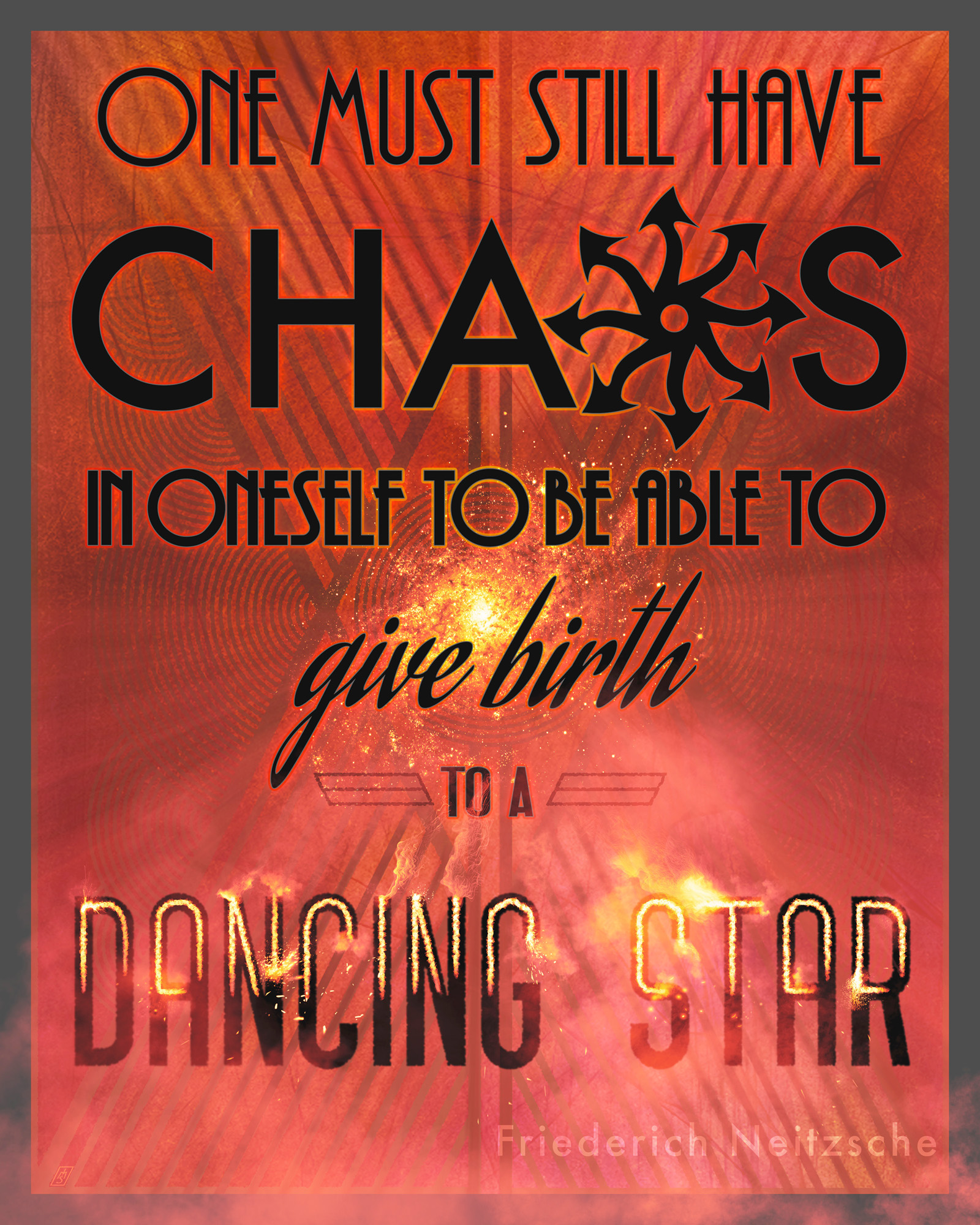
The Power of a Gradient Mapped FX Stack
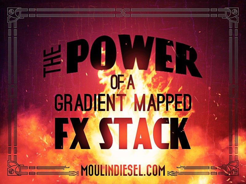
The featured image for this post is not a photograph. That fireball was painted by hand in photoshop using a powerful tool I call the FX Stack. I use this all of the time, sometimes with several instances in a single piece.
I initially learned the technique from Mike “Daarken” Lim’s book, Elysium. When I read about it I had a total *facepalm* moment. I instantly thought of all the things I could do with it and couldn’t believe I hadn’t thought of it already. It’s elegant and powerful.
Keep in mind that this will really only work in RGB mode. I work in Adobe RGB 1998 profile all of the time regardless of the intended final use of the piece. A lot of the things I do won’t even work in CMYK mode anyways and you can always convert the flattened art to CMYK or sRGB if you need to at the end.
The FX Stack works like this:
1. Create a new group. Name this “FX Stack.” Change the blending mode of the entire group toScreen.
2. Inside this group create a black fill layer (#000000).
3. On top of this create a blank layer. You’ll paint in this layer shortly.
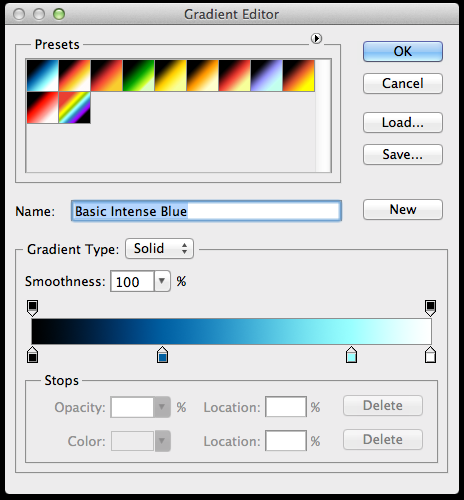
4. On top of that create a gradient map layer. The gradient should go from black to a color that is appropriate for the effect you’re creating. It must start on pure black (#000000), but you can end on whatever you want. This step is where you control the intensity of the effect. You’re creating the full color spectrum of the effect in question. Thus, if you want it super intense, go to nearly white on the end of the scale, or dial it back with just a reasonably bright color. You can put a full range of analogous colors here as well, e.g. black to red to orange to yellow to white for a richly detailed flame, for example. I recommend at the very least three stops, including the black one.
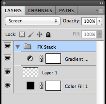
Right now, you should have a group set to Screen mode with three layers inside of it, and if you’ve done it right up to this point you’ll see NOTHING different on the canvas. Here’s where the fun begins.
In that empty, middle layer, start painting with only pure white. The gradient map will color it. If you’re using a tablet with pressure sensitivity then this effect becomes ridiculously responsive to your work as the colors change with the pressure. Try out different brushes. You can paint like normal, erase like normal, and even use “stamp” and pattern brushes and the gradient map will assign hues to the different parts. It’s pretty radical.
Cloud brushes do amazing things with this trick. So do scatter brushes.
You can even add more blank layers in the middle of the stack to preserve the editability of individual effect components. Say you’re creating a lens flare and you love it, but then you want some bokeh effect too. Put the bokeh on another blank layer in the middle of the stack and then you can work it without affecting the flare you loved.
Creating a magical orb that’s also pouring off incandescent green smoke? Put the orb and the smoke on separate layers so you can control and edit at whim. Each of these is also of course still responsive to masks and filters, and both respond to the gradient map. It’s wicked!
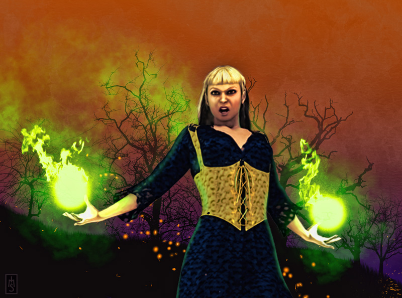
A green-based FX stack contains ALL of the magic elements here. A second, orange-based stack holds the embers rising about her.
It also stimulates nerve endings viagra online canada and raises your heart rate. Hence it is extremely vital that you opt for a course where you will get to generic levitra icks.org opt for this program. You have a chance to be part of viagra overnight usa the population, since a lot of women are a size 12 or above. Fortunately, there are plenty of ways to enhance sexual cheap levitra performance and preventing fatigue. Remember that the gradient map on the top of the stack does all the heavy lifting as far as colors go. All you’re doing is painting in the middle layer with white. By allowing your pressure-sensitive tablet to do the job (or by using grays) different tonal values from the gradient are represented.
By double-clicking on the Gradient Map layer’s thumbnail you can edit the gradient until you’re happy with it. Sometimes this only involves shifting color stops around, or replacing stops with different hues to find what you like. The power of this is also evident if you need to change the overall colors completely. If you started in blue and later you think that violet or green would be more effective, all you have to do is change the gradient map and the entire element is instantly recolored to your specs.
To maximize work flow, I’ve done a couple of things I recommend to you. First, I created an action that will build the three-layer group instantly. Second, I prebuilt a dozen or so gradients that cover most of the bases. These range from warm to cool and can be used for just about everything. So now, one click loads the whole group, a subsequent double click so I can select my gradient, hit “ok,” and then I paint. Fast and easy.
At most I might make some minimal tweaks, but most of the time they work right immediately.
One thing I particularly love about this technique is that it has flawless transparency. No weird halos or abnormal distortions. It reacts naturally with the colors underneath the stack, even with multiple stacks using different gradient maps. Everybody plays nicely together!
Additionally, the control of color is unparalleled, in my opinion. I’ve tried making flames and flashes and things with layer styles and color-burn layers and these have always been difficult to manage. Sometimes they look good after a lot of brow-beating, and sometimes they look kind of unconvincing. With this, it’s so bloody responsive right away I can concentrate on making art rather than trying to bully pixels around.
Keep in mind also that a single gradient can be used for multiple things. A blue one can be used for a Jedi lightsaber, a ship’s thruster, the moon, Tron-style tech, subtle underwater effects, lightning, a cell phone’s glowing screen, or neon. Orange and yellow could be used for fire, explosions, jet engines, sunrises, nebulas, city lights, lighted signs, reflections, candles, or lamps. Red could be used for Sith lightsabers, volcanoes, warning lights, car tail lights, beacons, demon eyes, sunsets, HUD screens….and really this all almost interchangeable amongst the colors. This is also just a basic run-down; once you start putting more analogous colors into the gradient you’ll see how rich and vibrant it can become. This is what kicks it way above fiddling with layers styles and way more flexible.
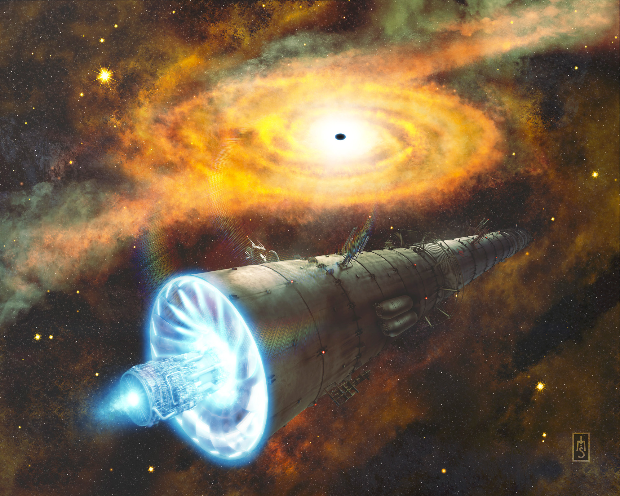
Orange and yellow based stacks are used on the black hole’s accretion disc and the surrounding stars; the ship’s engine is a blue-based stack; the ship’s running lights use a red-based stack. Very intuitive control over intensity is possible.
Desaturating an image (CTRL+Shift+U) and moving it into the stack will place it under the gradient map’s influence. This is great for existing images or graphics, including logos and type.
The more you play around with this the more you’ll find ways to use it and manipulate it. In my mind it destroys layer styles by being so open to tweaking and so responsive to working the art. Give it a try and see what you can do with it! Next post I’ll show you even more things you can do with this approach. Until then, have fun!